So you’ve developed your first roll of film and made a contact sheet and now you’ve got both a positive and a negative version of your images. What next?
If you said that you’d pick an image to print - you’d be right. Of course, you could do that. However, there’s something to consider before you jump into that whole next stage, like which one? How do you choose?
Evaluating your negatives is the next important step in your path to making a print in the darkroom. A path that can go multiple directions depending on how you approach the process. Many folks like to choose their images to print based on what they want to see larger and more officially as a ‘photograph’ and others will take their time, using the contact sheet as their first pass or ‘proof’ in order to approach making prints as a step in a larger process.
Both are correct, however, there’s a way to approach this so that you’re making the most of your precious resources - time and money (by way of your supplies).
Going to Print
Evaluating a negative is a collaboration between yourself, your negatives and your contact sheet.
You decide which images to make and which to print based on your intention and pre visualization of your work. You choose your first round of images from the compositions, subjects or scenes that you’ve captured. Do these fit or not, with the idea you had in your head. Is there a stand out that has to be included or is there one that will ‘go’ with your idea and another that won’t but should be saved for another body of work or series?
This first round of curating is essentially part of finding images that fit your idea of the body of work as well as what you aesthetically find desirable. It is not uncommon to see folks circle frames on their contact sheets with red marker or use small post-its to indicate which images they need to investigate further. In the image below. The example is a contact sheet with images of Richard Avedon at opening of Diane Arbus exhibition at the Museum of Modern Art, 1972 by Sarchiapone, Cosmos Andrew, 1931-2011, photographer. You can see the notes that are written as part of the photographer’s notes to self and the other circles, arrows or markings that indicate either an important image or element. A lot of the notations tend to be some sort of ‘code’ that is often unique to the photographer. I myself, like circling what I need to look at first but I’m sure depending on the photographer and what their needs are, they will add more or less detail per their own method of working.
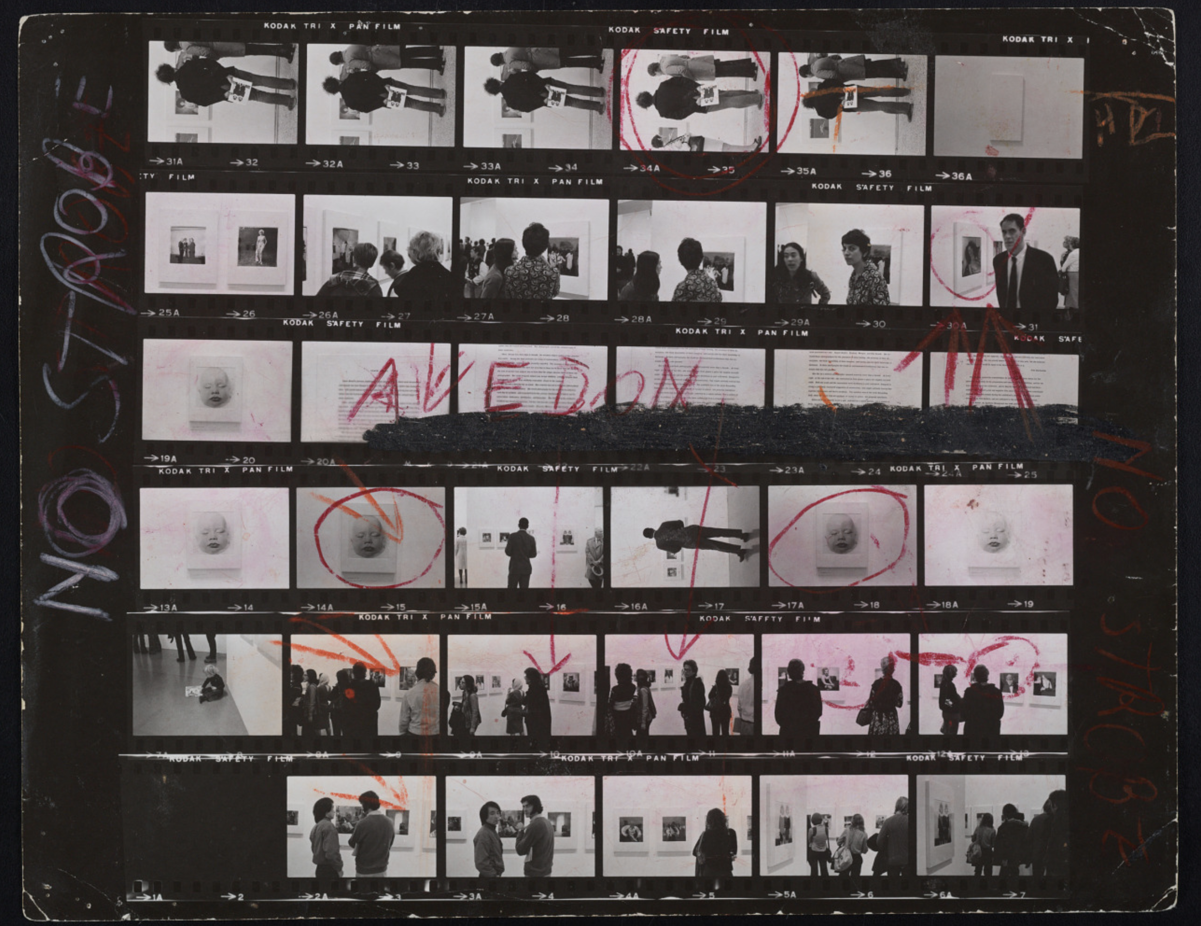
Smithsonian Archives, Cosmos Andrew Sarchiapone papers, circa 1860-2011, bulk 1940-2011
Comparing your Contact Sheet + Negative
Once you’ve got an idea of which images you want to work on, then you need to study them. What are you looking for? Overall, you’re looking to see if the image you want to print actually will be worth printing.
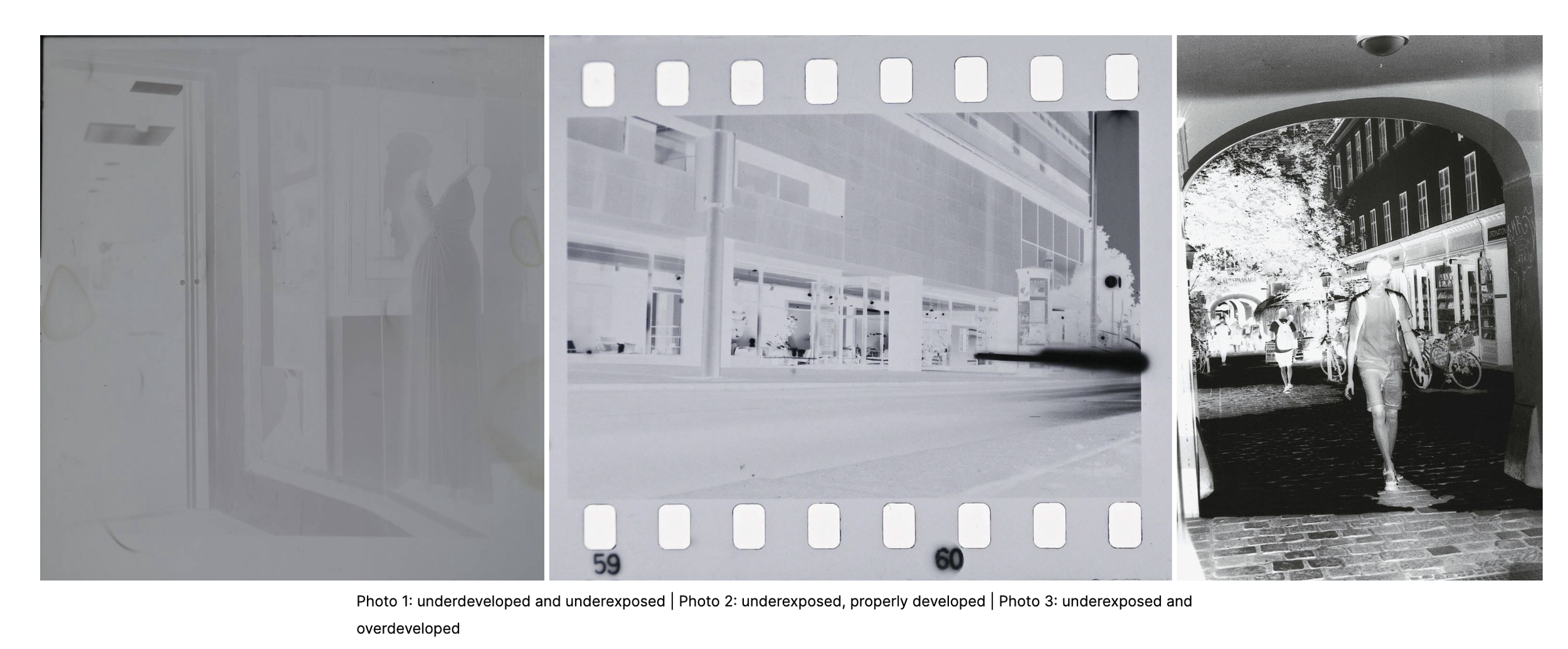
Image Credit: written by eparrino on 2022-12-22 #tutorials #negatives #exposure #darkroom #self-development #darkroom-print #inspect-the-negatives
Photo 1: Underdeveloped and underexposed
Contrast is flat - lacks clear definition of highlights and shadows
Density is low - overall small latitude of values and no clearly sharp areas or edges, overall very thin or very opaque negative
The Result: this image will never be able to be anything other than a print which mirrors the detail, density and contrast that you see here in the negative, regardless of the work one does to alter contrast, dodge, burn or tweak paper exposure or development. For most images like this - it would be more efficient to reshoot and expose, then develop the film correctly.
Photo 2: Underexposed, properly developed
Contrast is clearly defined but not throughout the whole image, only in the extreme examples of highlights and shadows with little depth of middle values / mid tones
Density is light and the negative is very thin in most areas with the negative overall very near to transparent in all but the extremely bright highlights
The Result: While there are areas of distinct detail - the negative will be very quick to print and may not expose well at a time which allows the silver in the paper to properly expose to the light, therefore resulting in a very dark and low detailed image with the possibility of not ever reaching complete black in the darkest shadows because exposure time isn’t long enough to activate the silver in the paper’s emulsion.
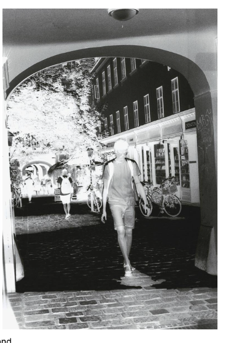
Photo 3: Underexposed, Over developed
Contrast is quite high and there are distinct and clear differences between the highlights and shadows. Values in the mid tone range are perhaps ok but as they move towards either shadows or highlights, tend to disappear into either side of that range of exposure value. Some use of contrast filters can help make more ‘space’ between the middle values but the image also might need some dodging and burning to get it just right.
Density is fine - good differences in density and opacity and transparancy seem to match the values they’ve captured proportionately. The mid tones seem to be a little less nuanced or varied in detail but are an improvement and better for printing than the first photo and the second.
The Result: While far from perfect, this negative has a preferable amount of detail in most areas of the image including detail in a majority of the opaque = highlight and the transparent = shadow areas of the negative. This is a negative that you can work with, event hough there are some ‘problem areas’ you may need to suss out in the darkroom.
How do I evaluate the negative?
This image (above) can be evaluated through analyzing the areas that are great to print, as they are (in Green) the areas that are going to most likely need more light and maybe even some burning to get the detail you see in the negative in the print (Magenta) and the areas that are shadows and have detail but will need some dodging in order to retain the detail that you see in the negative (Cyan)
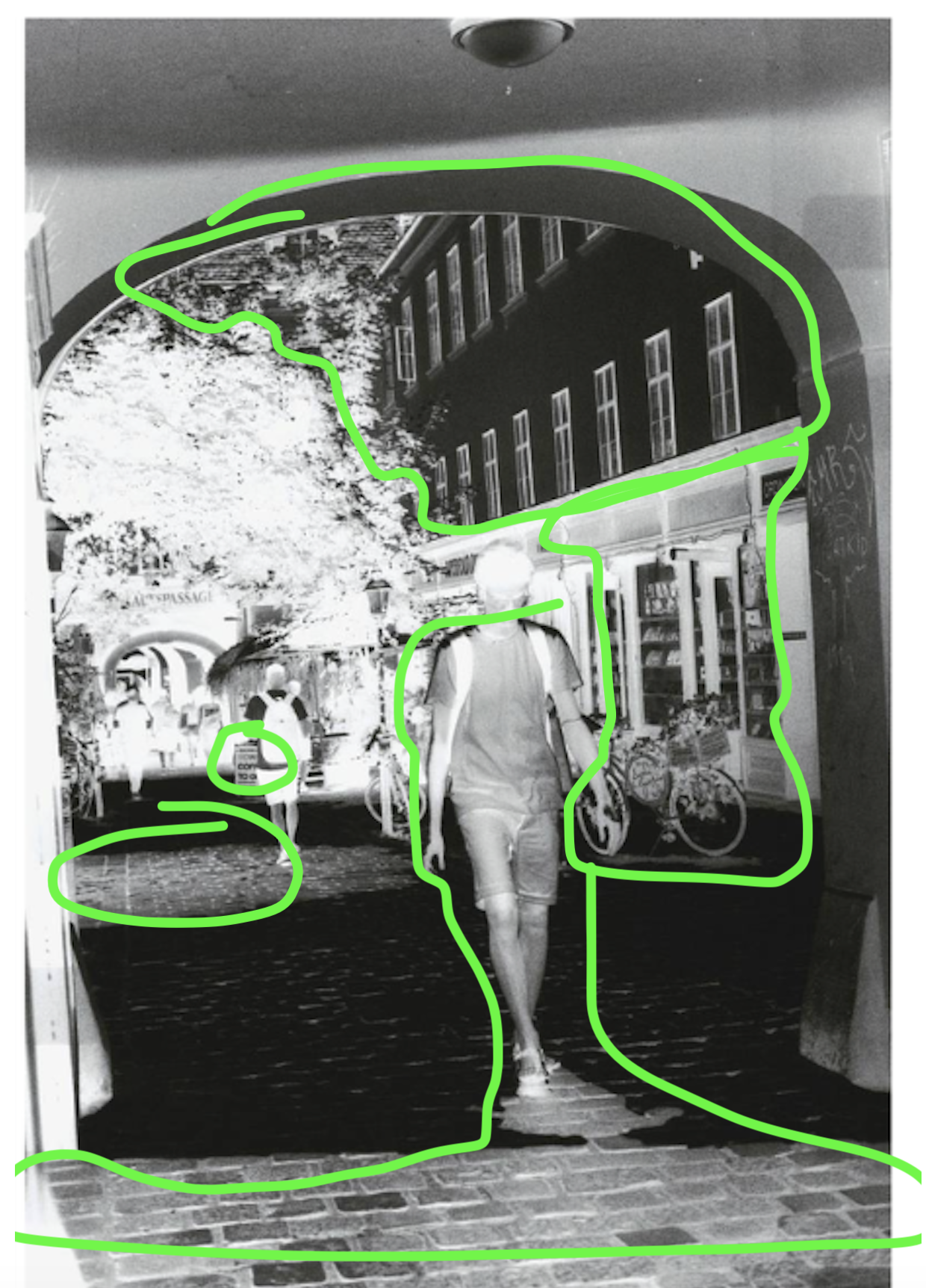
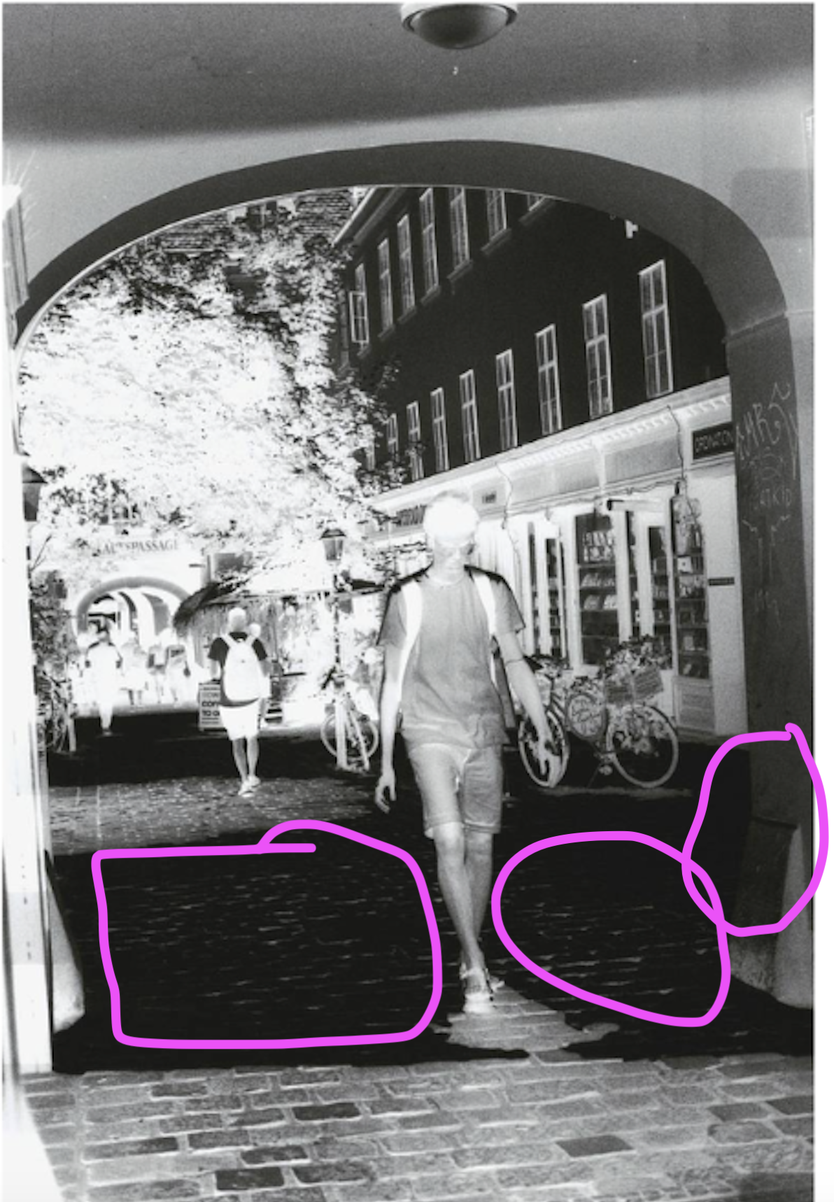
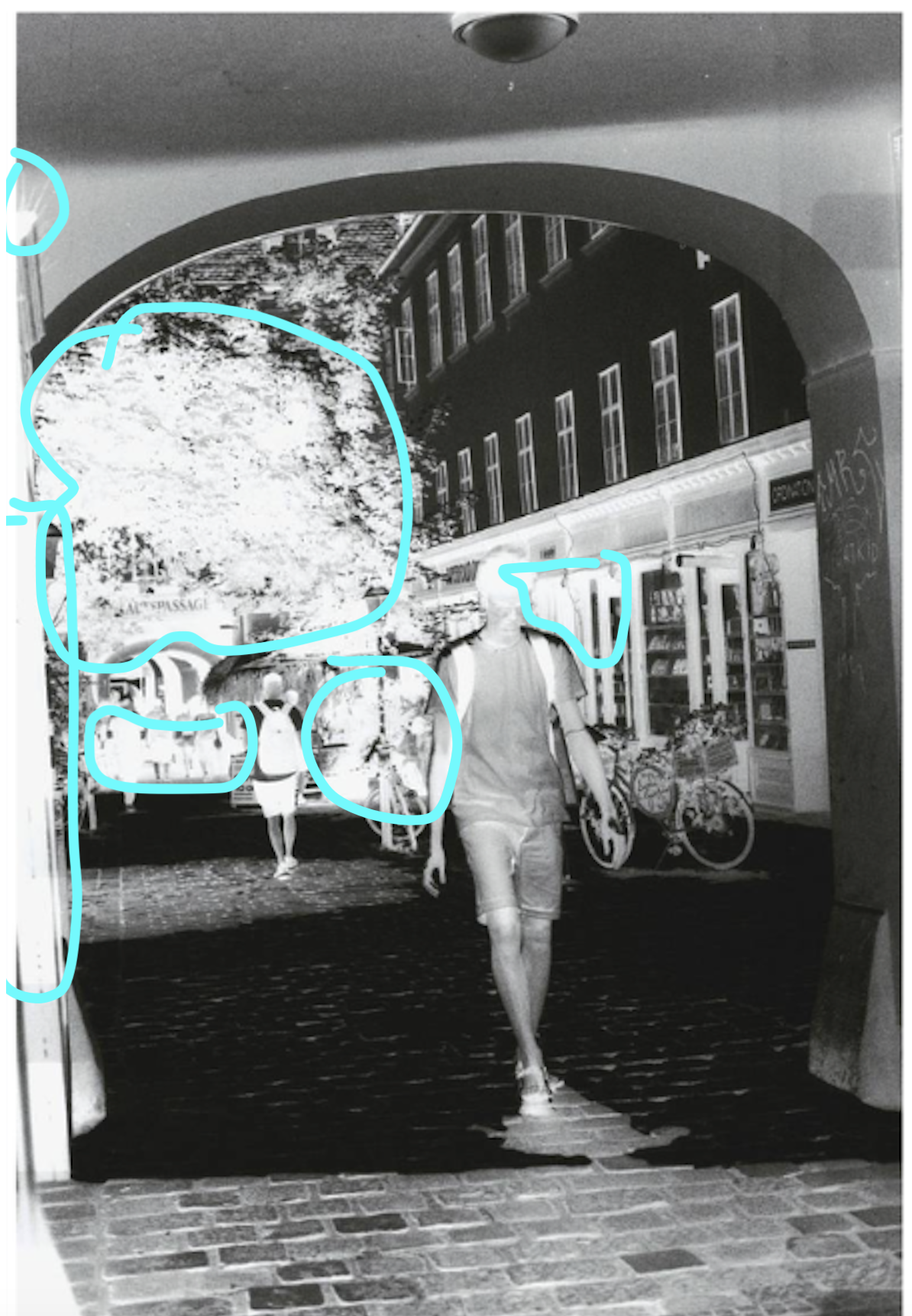
Knowing what is in store as you attempt to print a negative gives you a good view of how you might best approach printing a negative successfully.
Summary
Practice taking a beat to complete this step in your progress towards making your first print - the more you do this, the easier and faster and more accurate (I might add) your assessments of negatives will be and the more successful and quick your printing. Learning to work with any new material is going to be a process of trying, doing and reflecting - the more go through that cycle and take time for each step - the more you improve and develop your intuition through experience, not assumptions.